
Inject a little color into your fall wardrobe

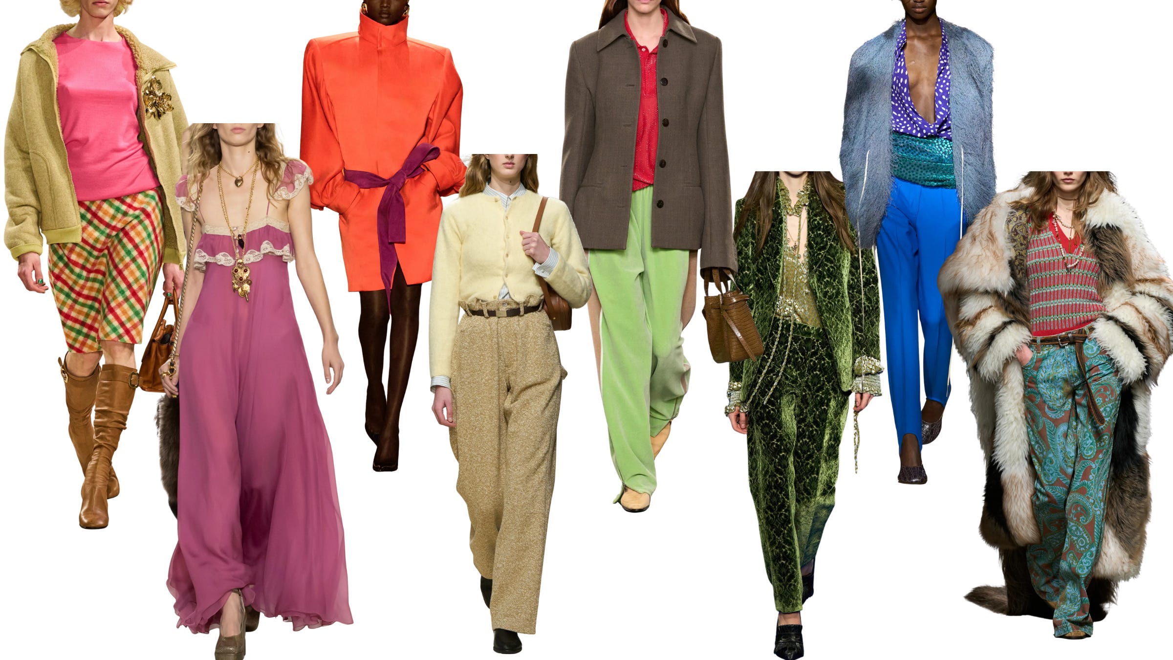
For the past few seasons, we’ve been awash in a sea of beige and neutrals, but something magical has been bubbling up both on and off the runway: COLOR! And not just the predictable pops of red that became second nature for so many brands, but rich, saturated shades of yellow, greens spanning from forest to astroturf, lush oranges, and beyond the bursts of color! And along with color there are prints galore, with everything ranging from animal, to retro-inflected, to your typical plaids and checks in iterations that feel fresh and exciting.
But as with anything that takes places on the runway, the question becomes, how do you bring it into your own closet in a way that feels natural? I was talking with someone last week about today’s newsletter, and they told me they were excited to read it because they’ve been wanting to add more color to their wardrobe. I told them the same thing I’ll tell you: only go as far as you feel comfortable. I think we’re often told that having “good” style means constantly pushing ourselves beyond what feels comfortable. And while I do believe that developing a sense of personal style requires some trial and error, I don’t think that process lasts forever. At a certain point, you start to understand what feels like you, what works and what doesn’t. So when you do decide to change or experiment, it doesn’t feel like a foreign pursuit but rather a natural extension of where you are in that moment.
So for those of you interested in injecting more color into your wardrobe but unsure where or how to begin, this one’s for you. I’ve broken it down into three levels, each showing a different way to bring color and print into your looks. I decided to break this discussion into levels rather than categorizations like “novice,” “intermediate,” or “expert,” because the point isn’t to provide a roadmap to becoming an “expert-level” color or print wearer. It’s more about offering options and letting you, the reader, decide how you want to play with color and print.
Level 1
The Non-Committal Addition
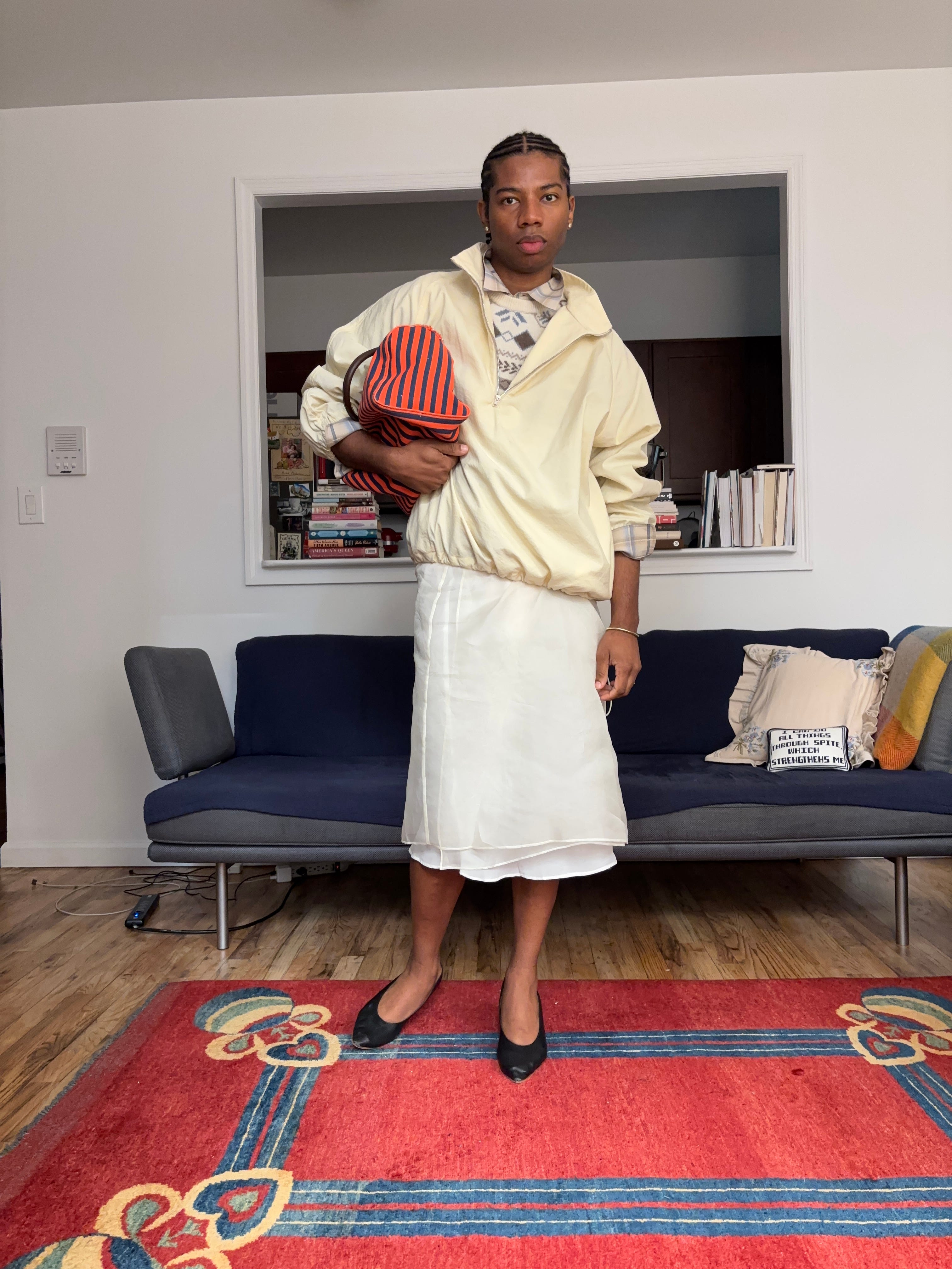
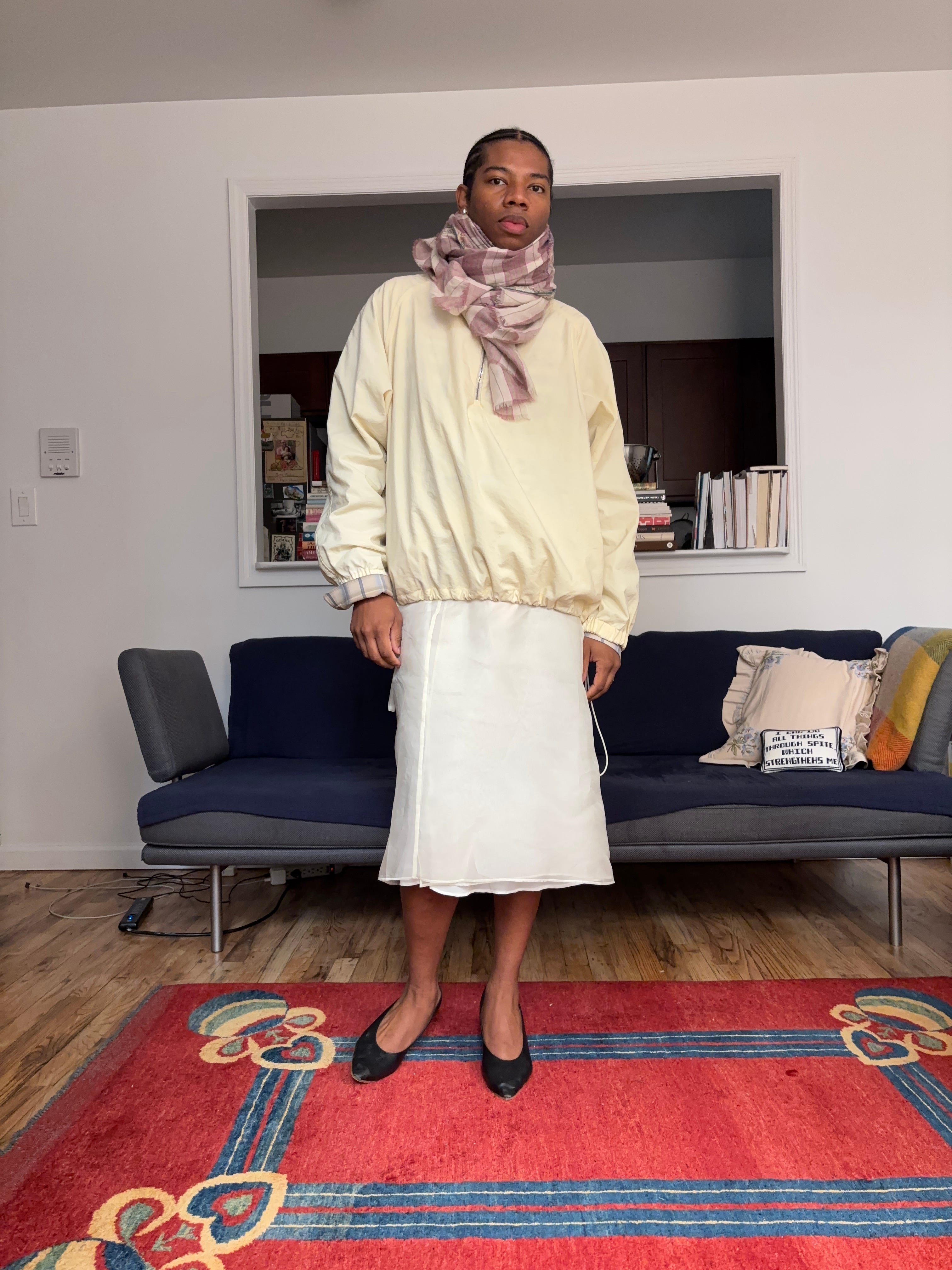
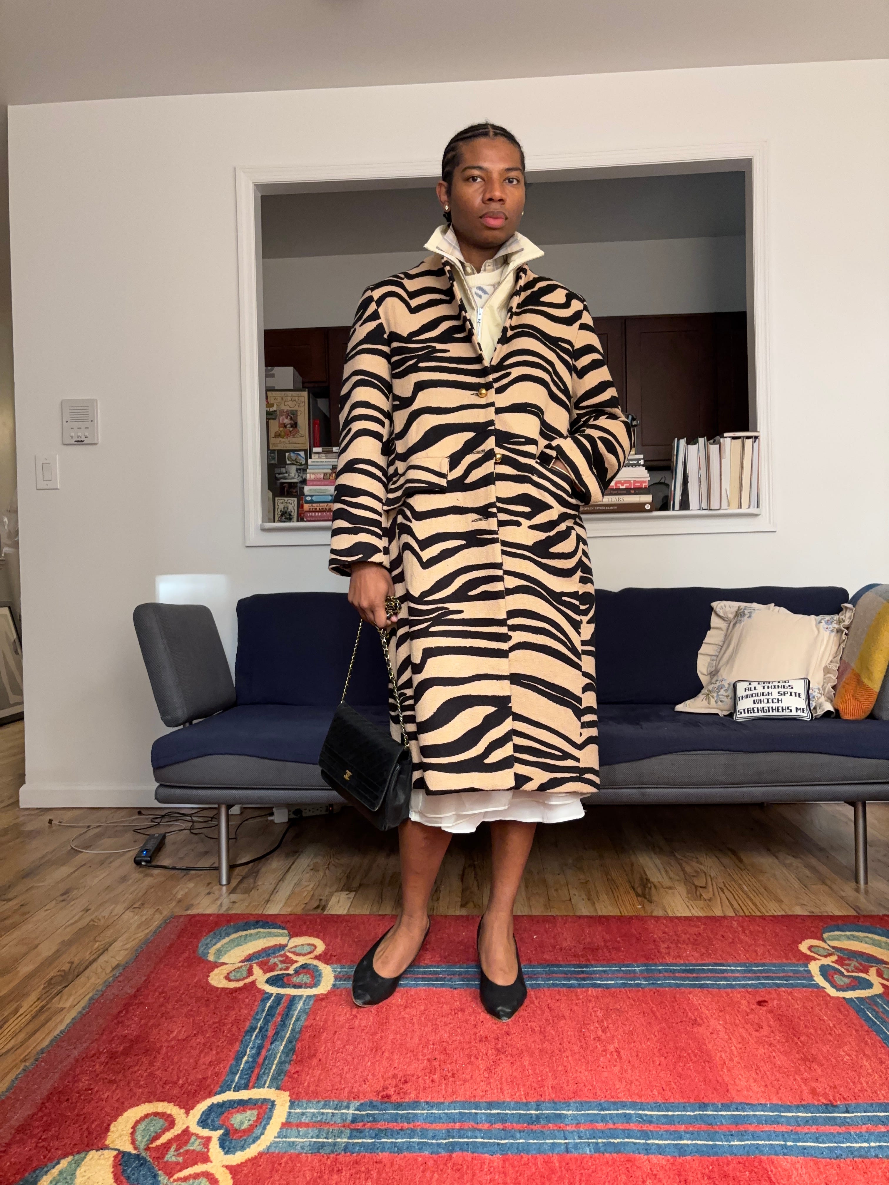
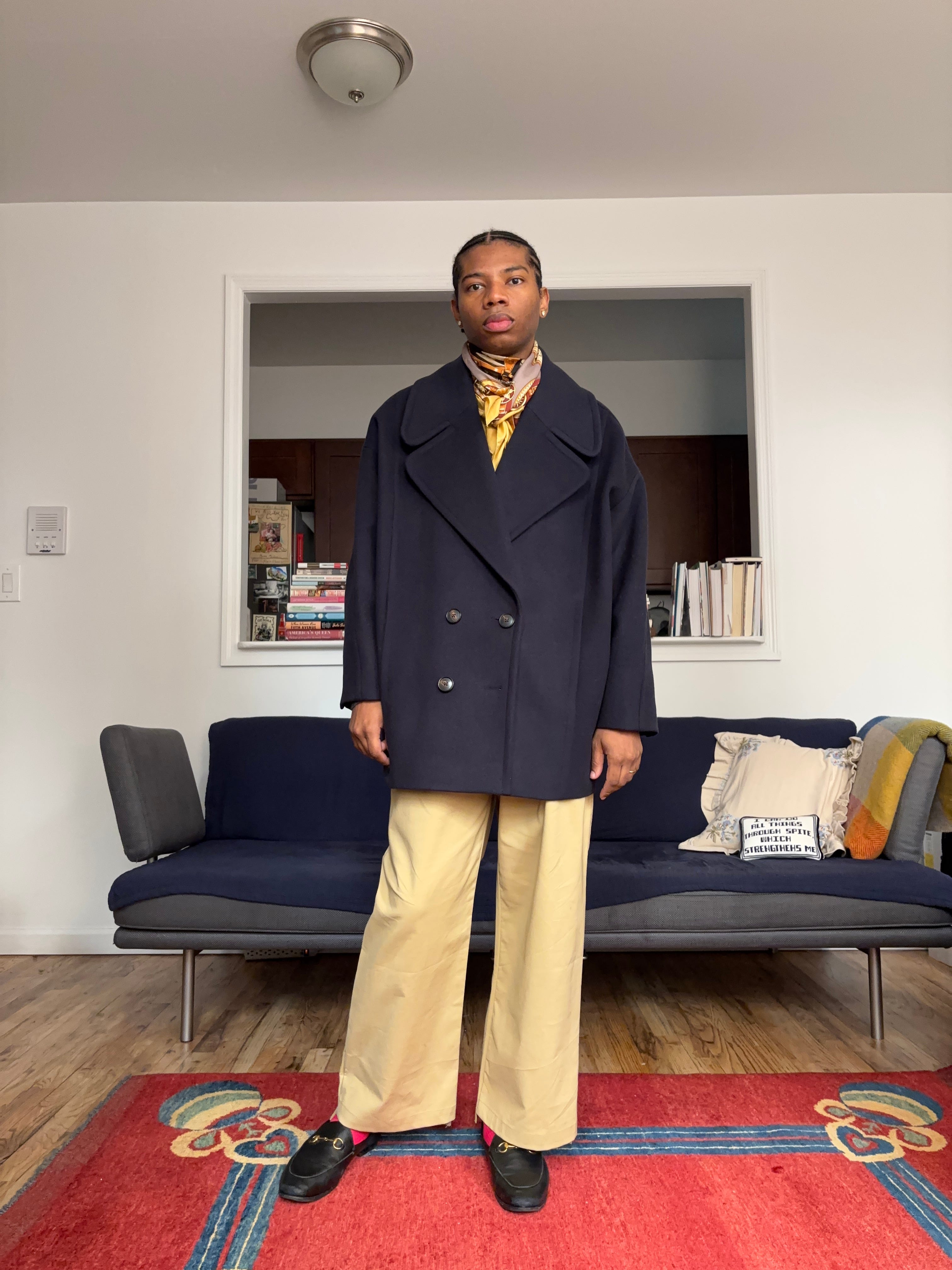
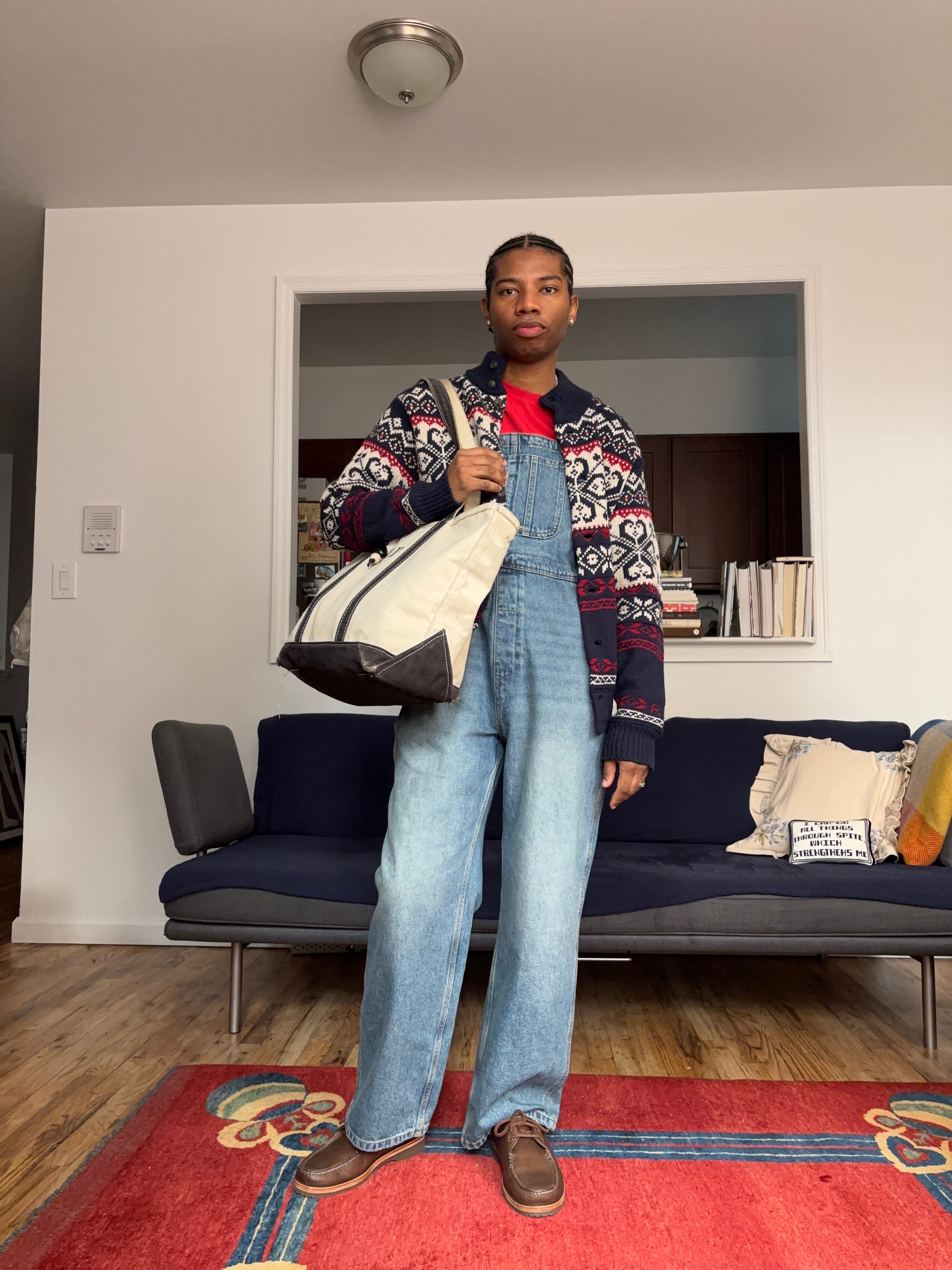
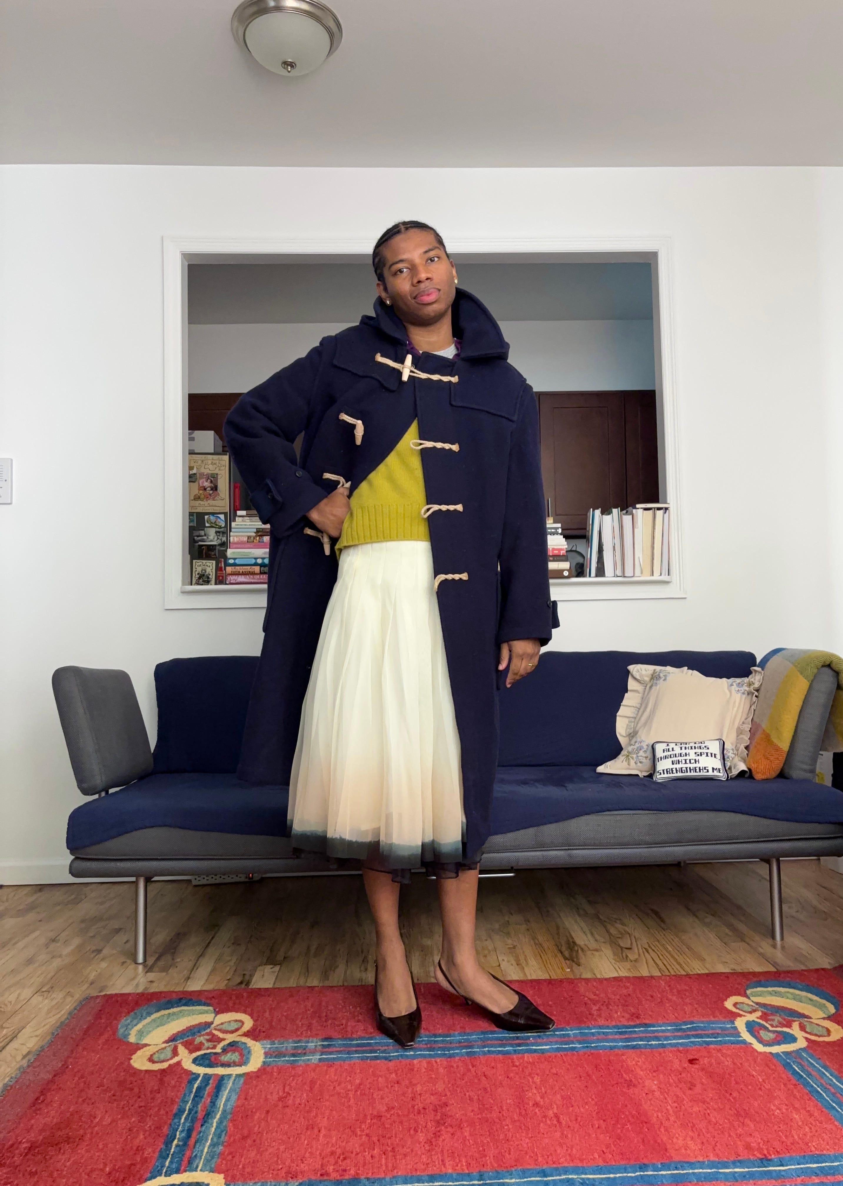
For me, the non-committal additions usually revolve around accessories. These are the pieces you throw on for the morning commute but have the option to ditch once you reach the office or that breakfast meeting. Maybe the print or color felt right when you were still half asleep, but by the time you’ve had coffee, you realize it might be too much. This could mean a scarf in a vibrant print or saturated hue, a bag that brightens up an otherwise neutral look, or, as we move into colder months, a bold coat that brings an entire outfit to life. The beauty of these pieces is that they don’t require long-term commitment. You know at some point in the day, the coat comes off, or the scarf gets tucked away, so the burst of color feels more playful than permanent.
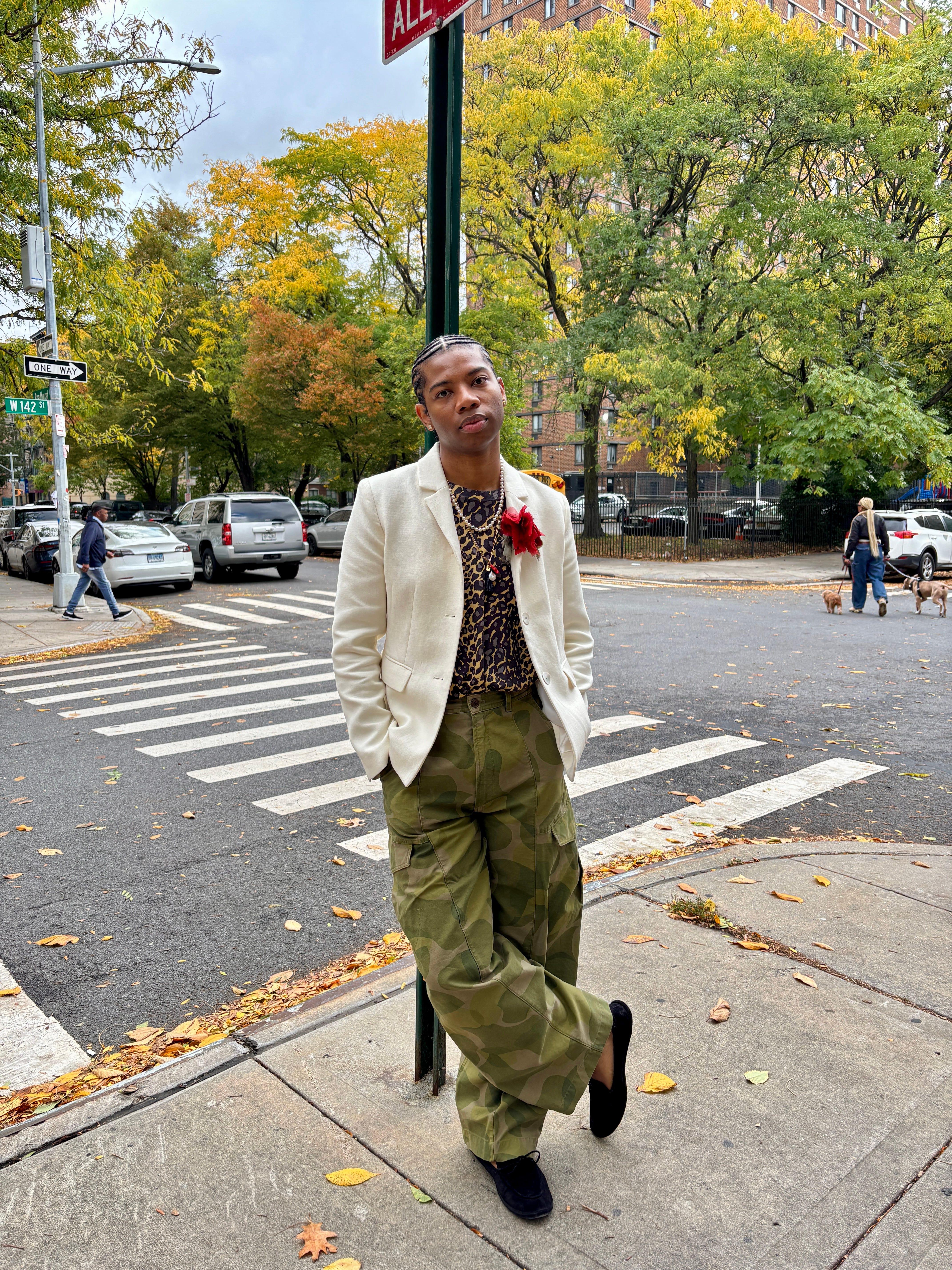
Supporting Actor Pops of Color
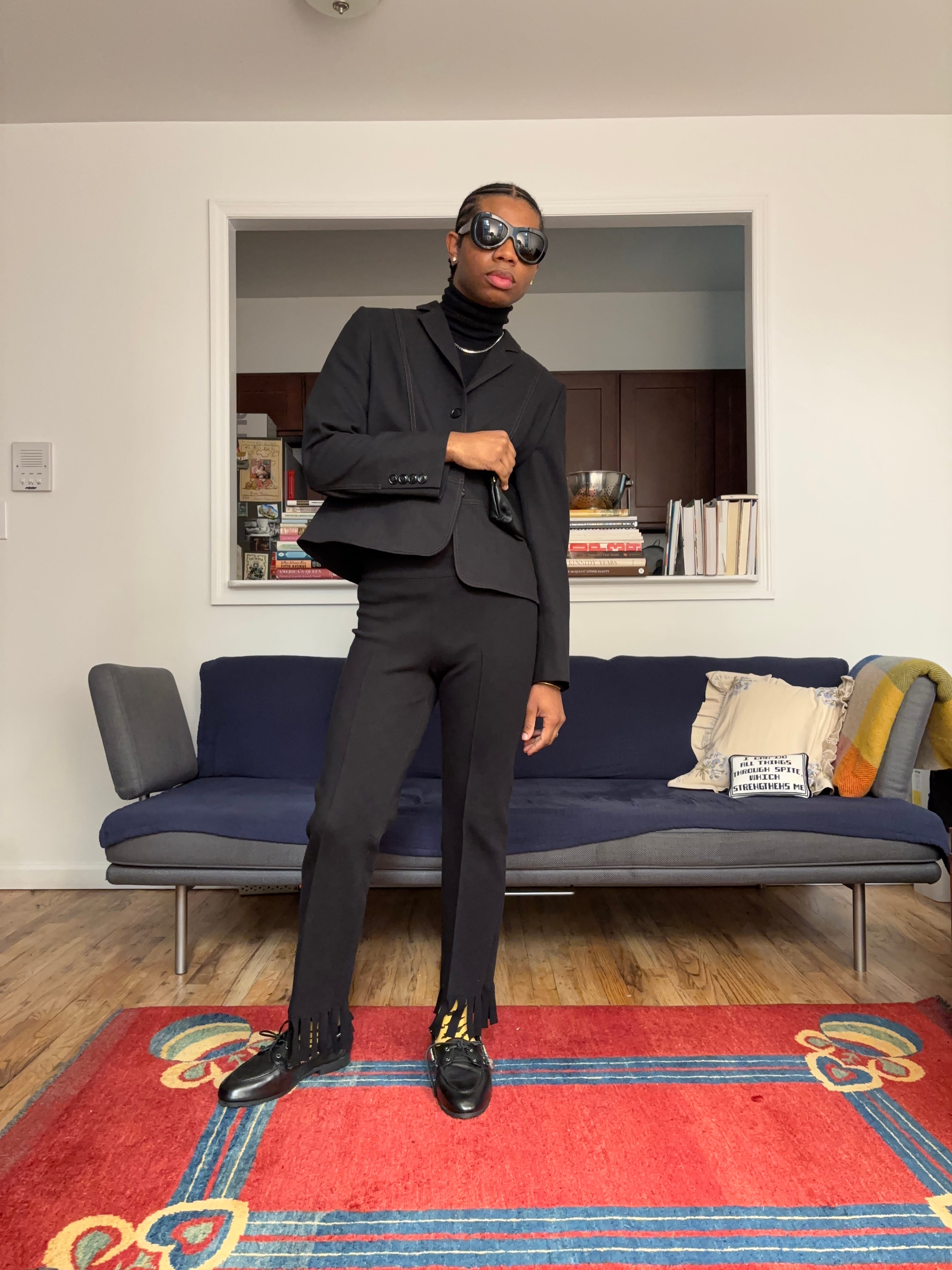
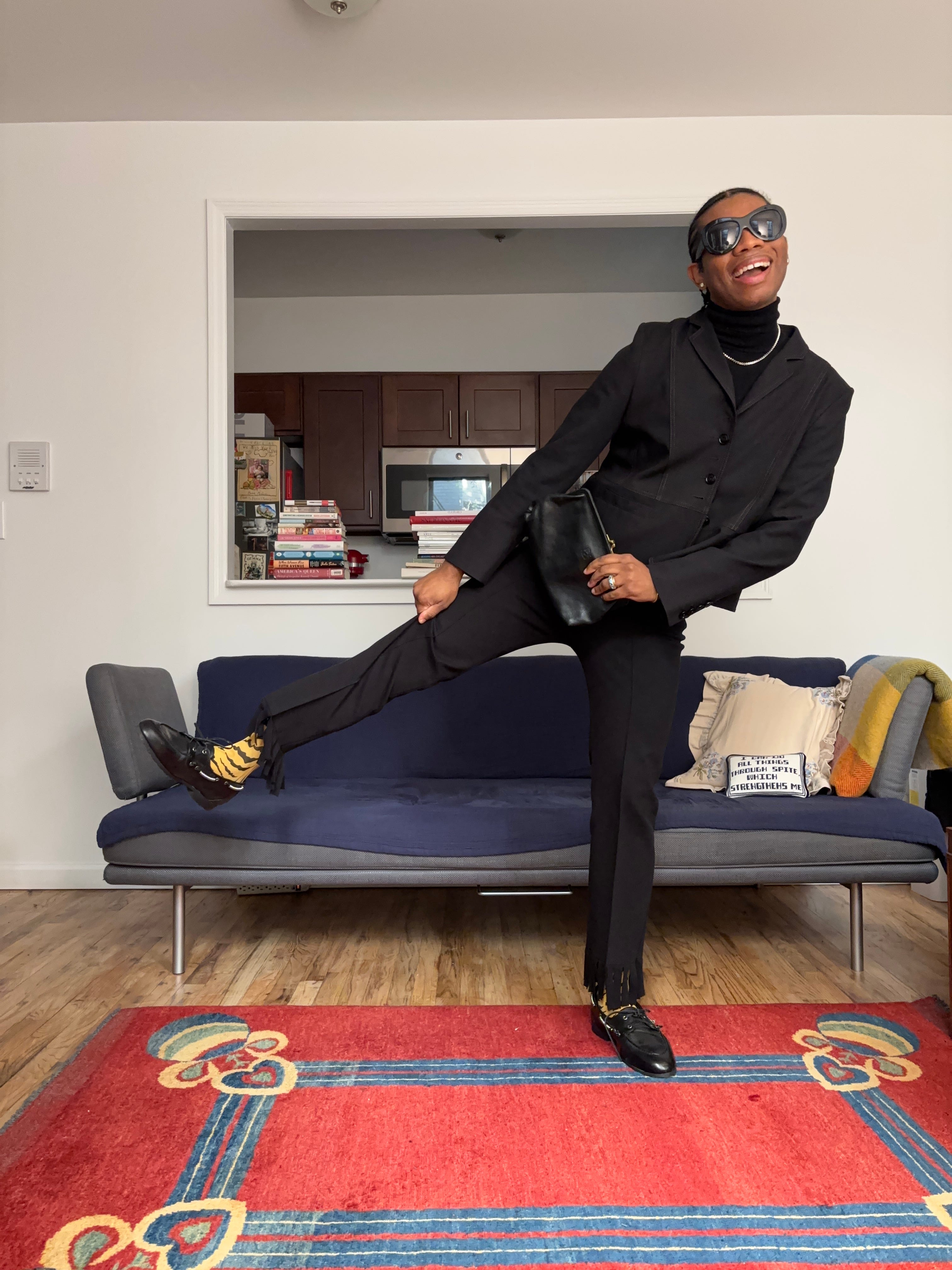
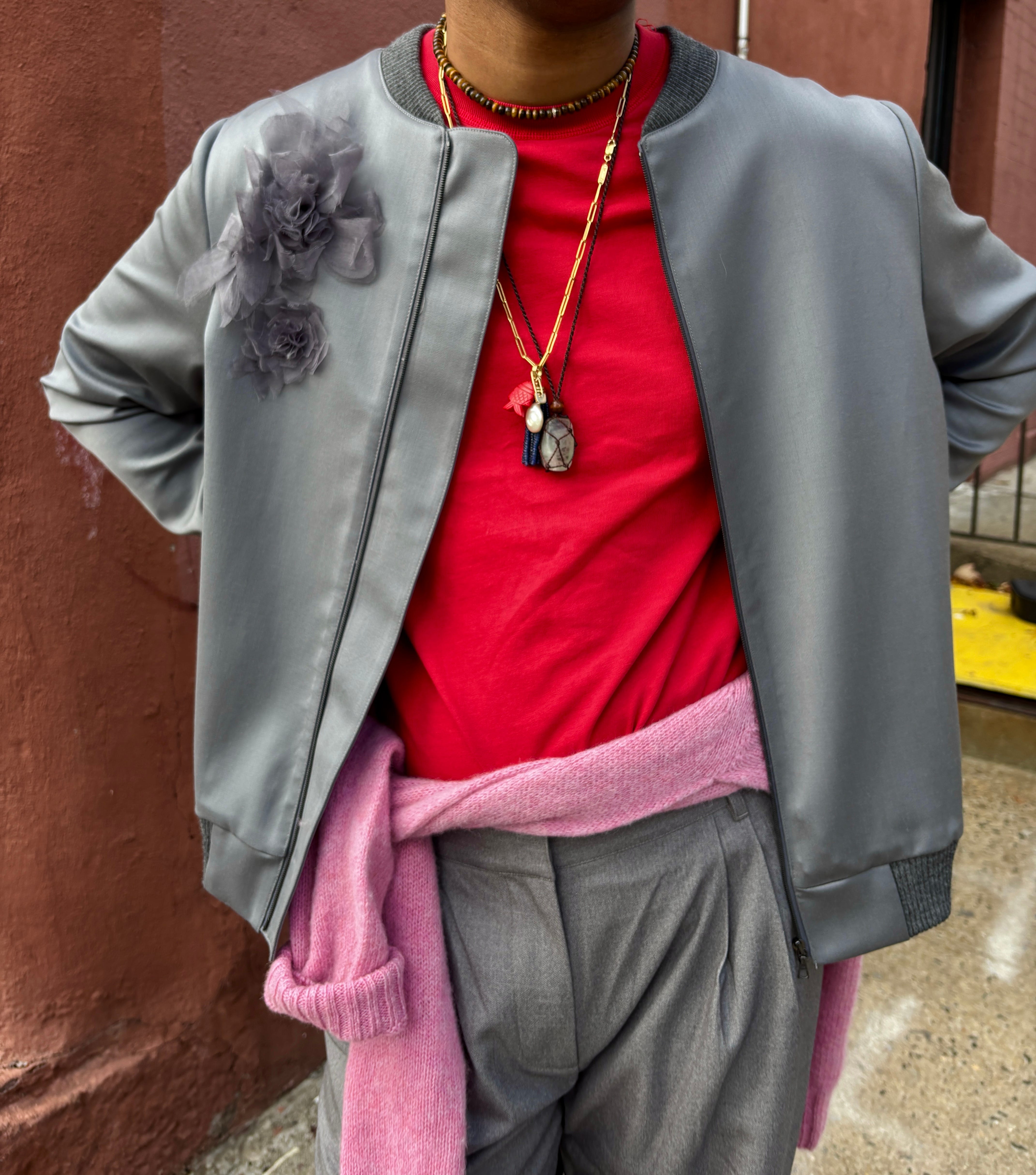
A few newsletters ago, I wrote about my thought process when getting dressed and how pieces often fall into one of two roles: lead actors and supporting actors. Just like in any great film or play, every role matters. The lead actors in your outfit are the pieces that command attention, while the supporting ones may not be essential but still elevate the overall look. Without them, an outfit can feel flat. These categories aren’t fixed, of course, there’s room to interpret them however you like. When it comes to supporting actor pops of color, think about details like colorful or patterned socks and tights, or in some cases jewelry (Every day I wear this blue enamel ring from Selim Mouzannar, even when it doesn’t necessarily go with the rest of my outfit. At this point, I feel naked without it.). They’re small touches that might seem optional, but their presence adds personality and depth.

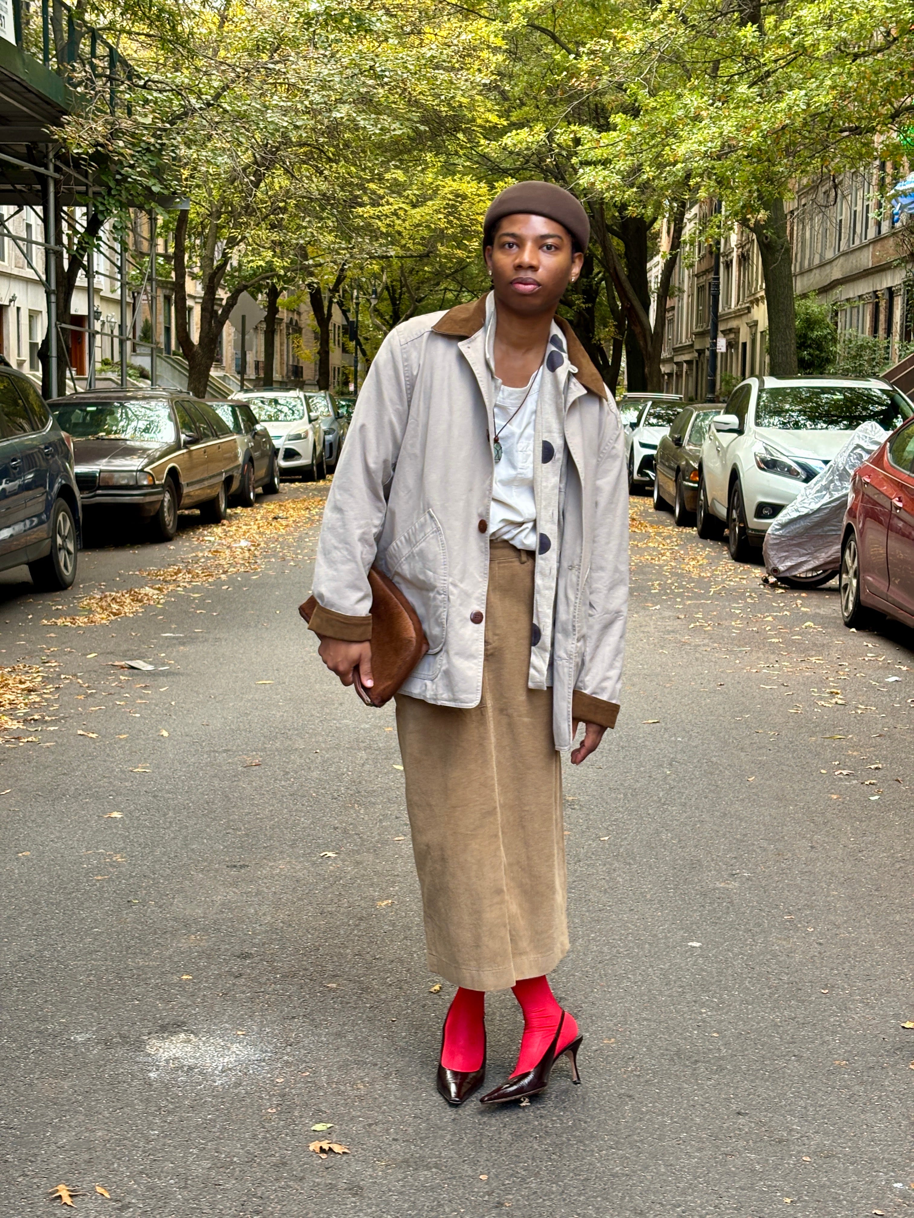
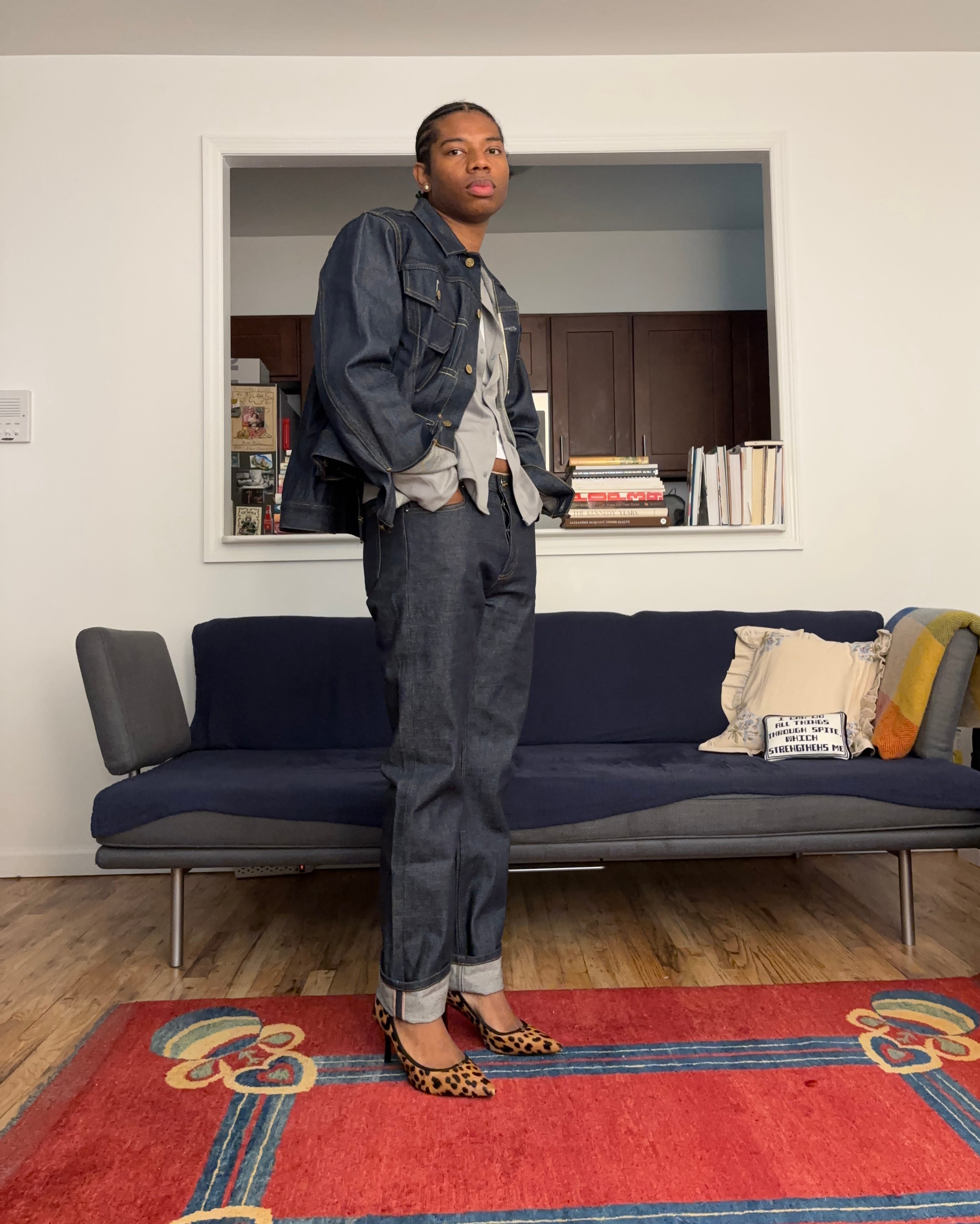
Letting the Shoe Speak for the Outfit
I tend to think of shoes as natural lead actors that can step back and play a supporting role when needed. In an all-denim outfit or a mostly monochromatic look, a statement shoe is an easy way to introduce color or print without feeling overpowered. It’s a small but deliberate move that changes the entire tone of what you’re wearing.
Level 2
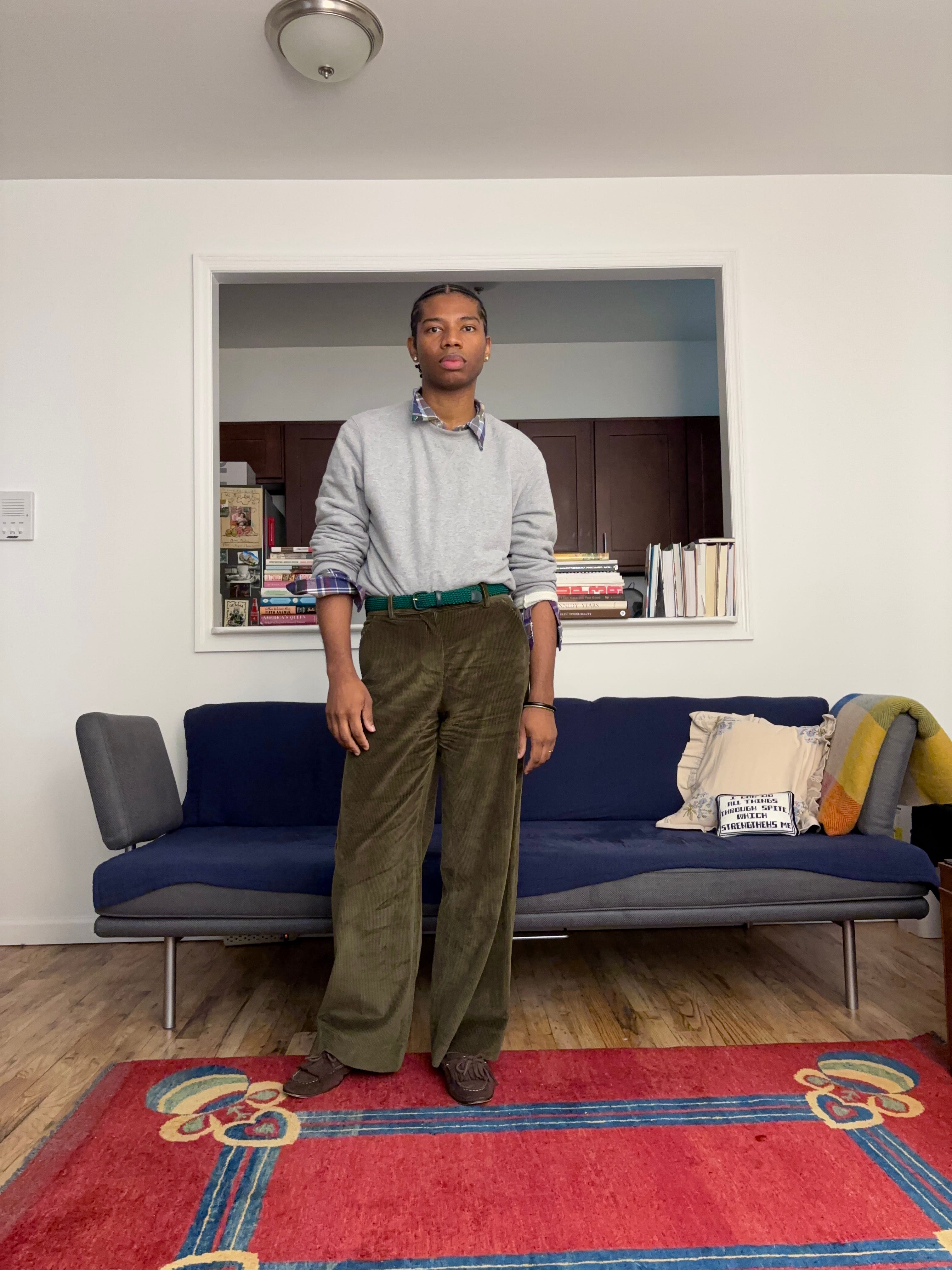
Think Green
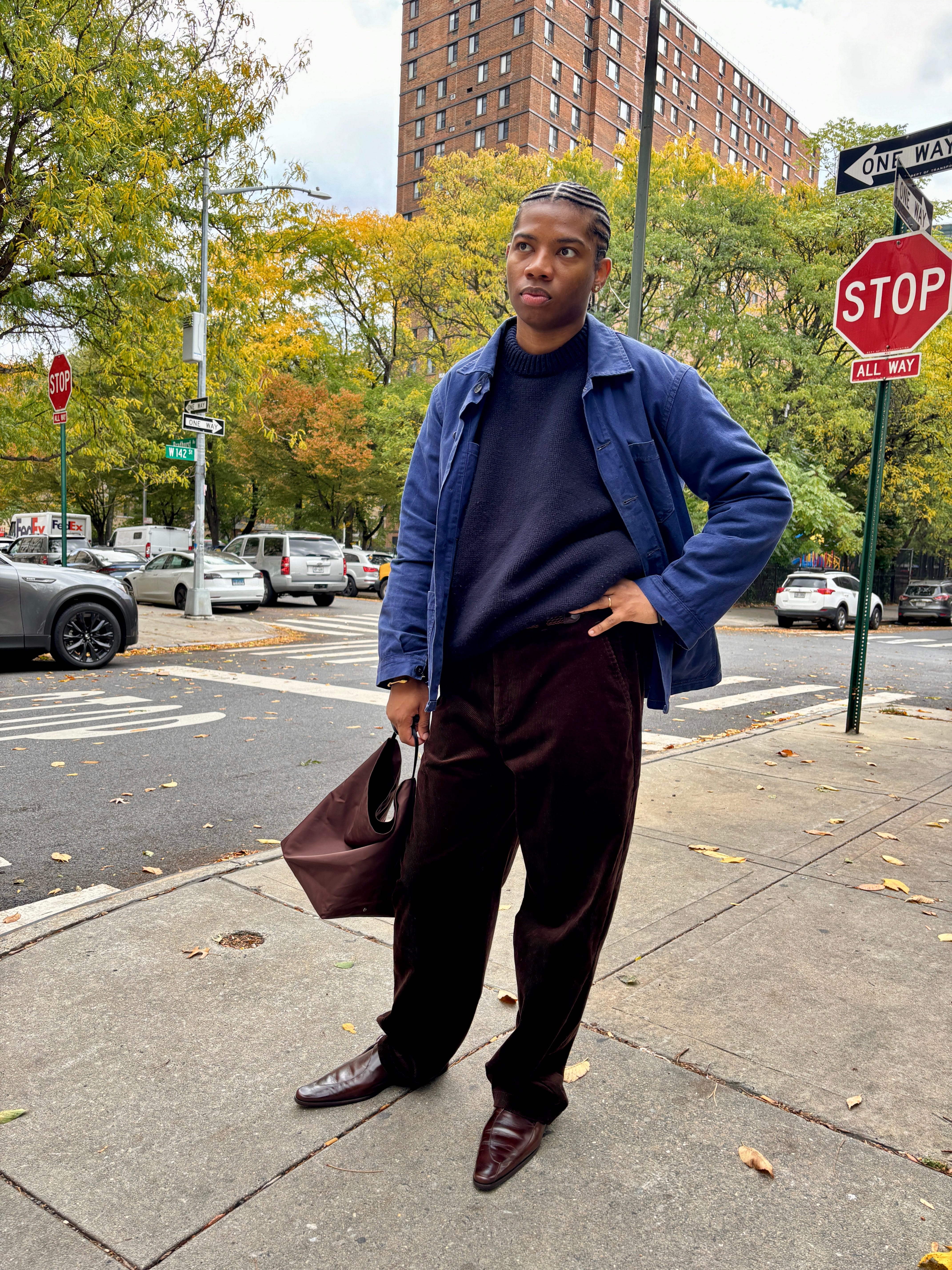
Green is one of those colors that feels like an easy yes. It sits comfortably between neutral and statement, which is what makes it such a good entry point for anyone looking to bring more color into their wardrobe. It carries a kind of calm that doesn’t shout for attention but still feels alive (especially the mid-range tones like olive, sage, and moss). They pair seamlessly with the classics you probably already own: denim, navy, khaki, grey. Even the bolder shades like kelly or grass have a freshness to them that reads more intentional than risky.
Leading Actor Pops of Color
On the flip side of the supporting pieces in your outfit, the leads are the essential parts that make the look come together and stand out. This is where swapping your usual white T-shirt for one in color adds a bit of interest and draws the eye in a new way. It’s also where you might opt for a dress in a strong, bold shade instead of a neutral, something that instantly carries the look without needing much else.
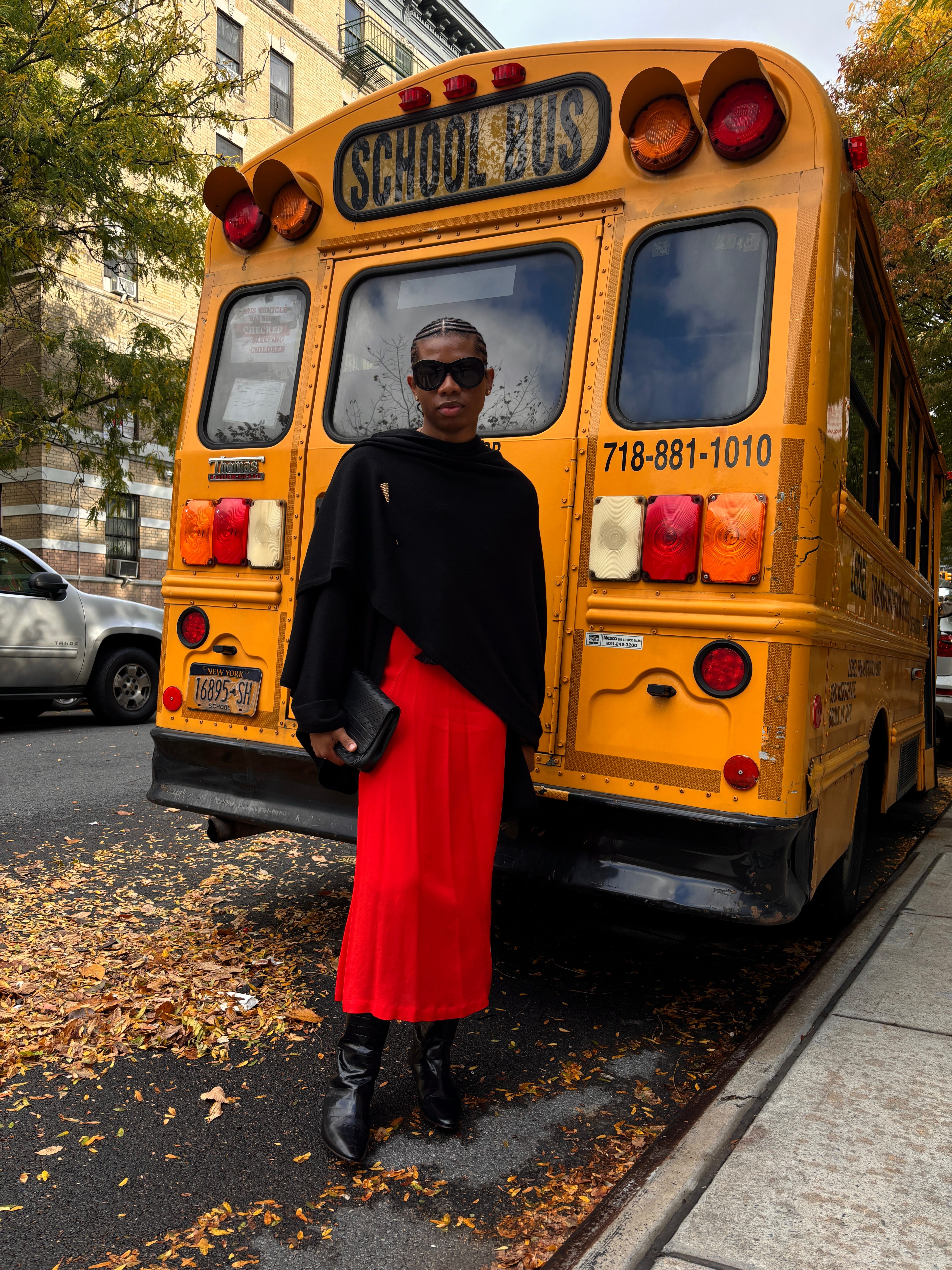
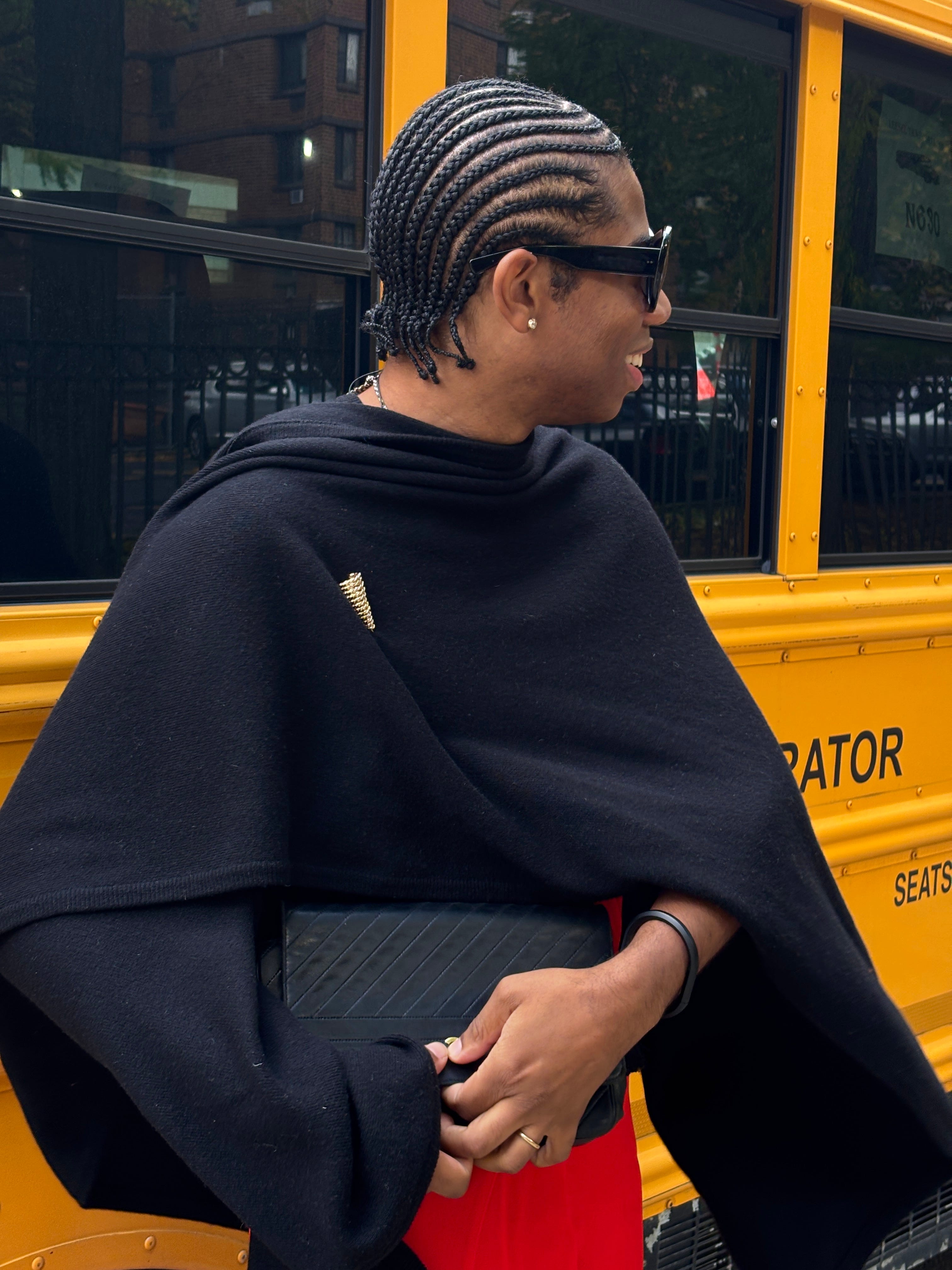
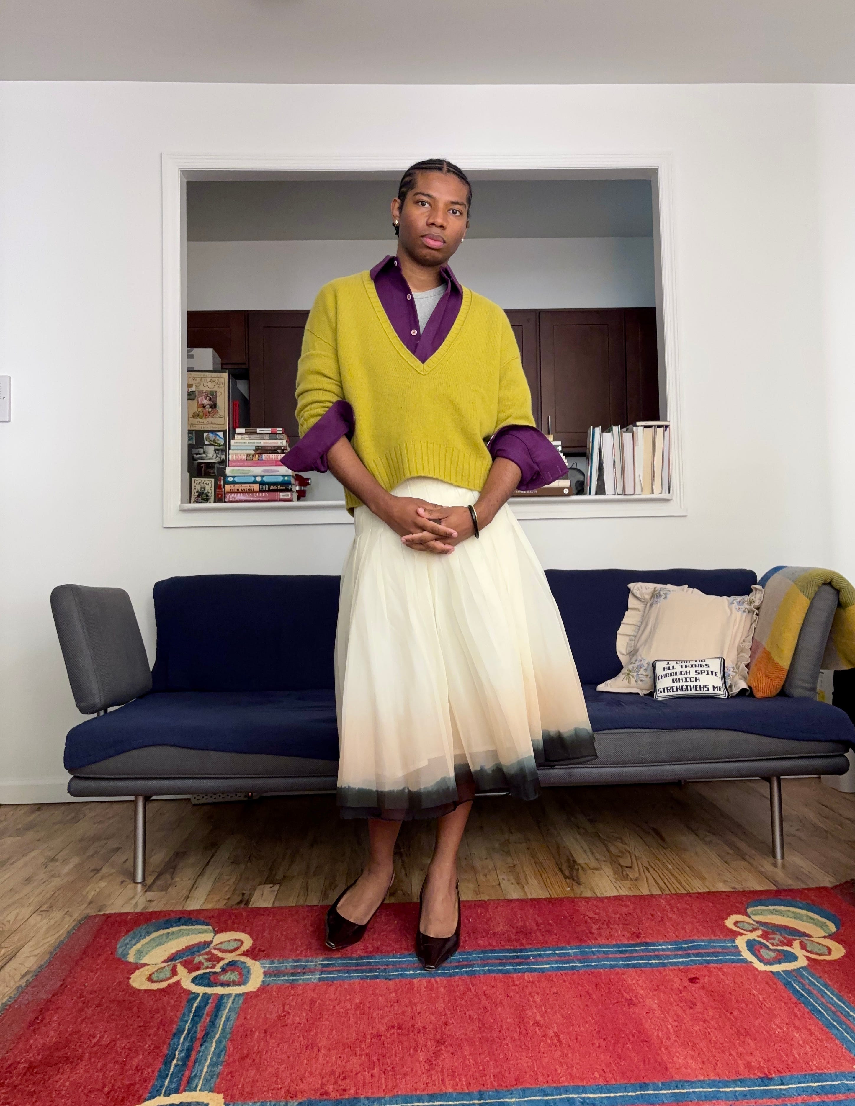
Color Duos/ Sandwiching
When it comes to dressing with color, sometimes setting a limit on how many you want to include helps take the stress out of figuring out what goes with what. Another useful trick is “sandwiching” your colors, placing the brighter tones between neutral anchors.

Level 3
When it comes to color, you could look at a color wheel or any number of rules that supposedly tell you what “works.” I tend to believe that if the balance feels right to your eye, it probably is.
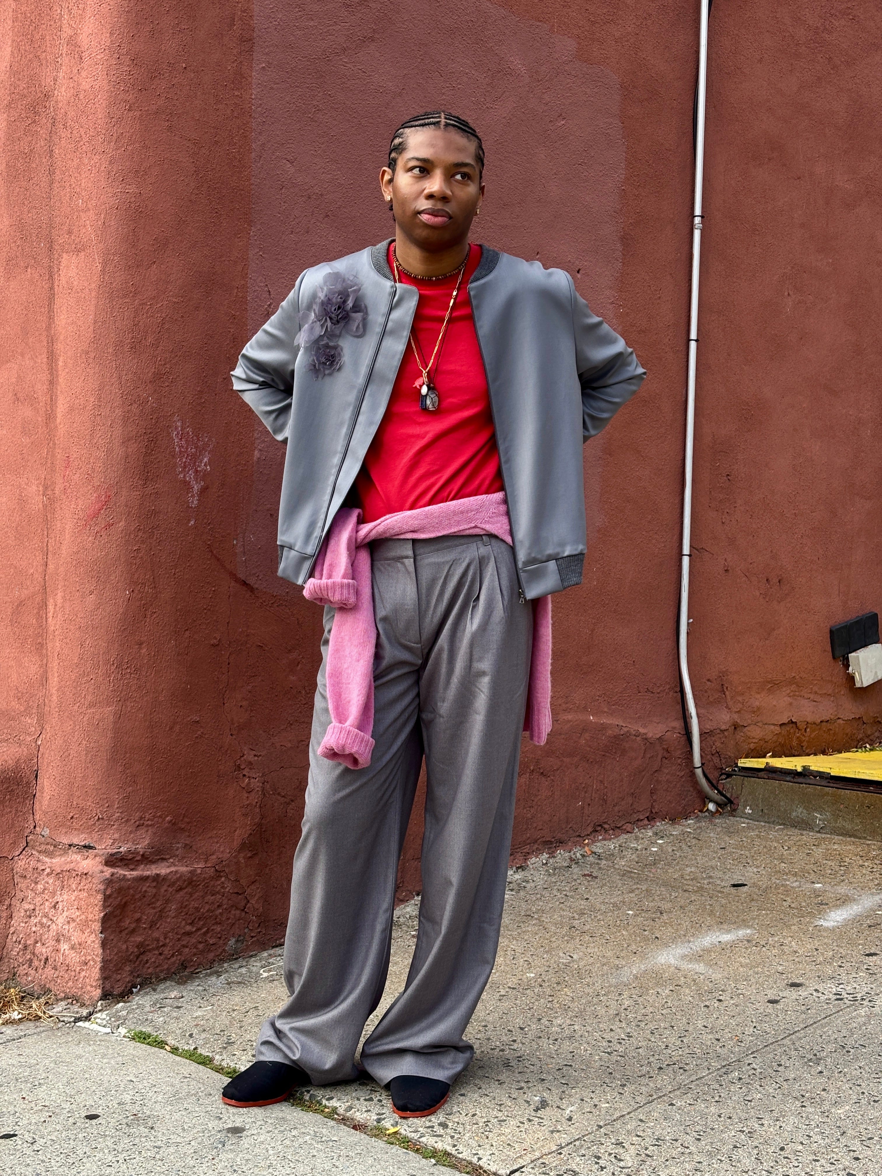
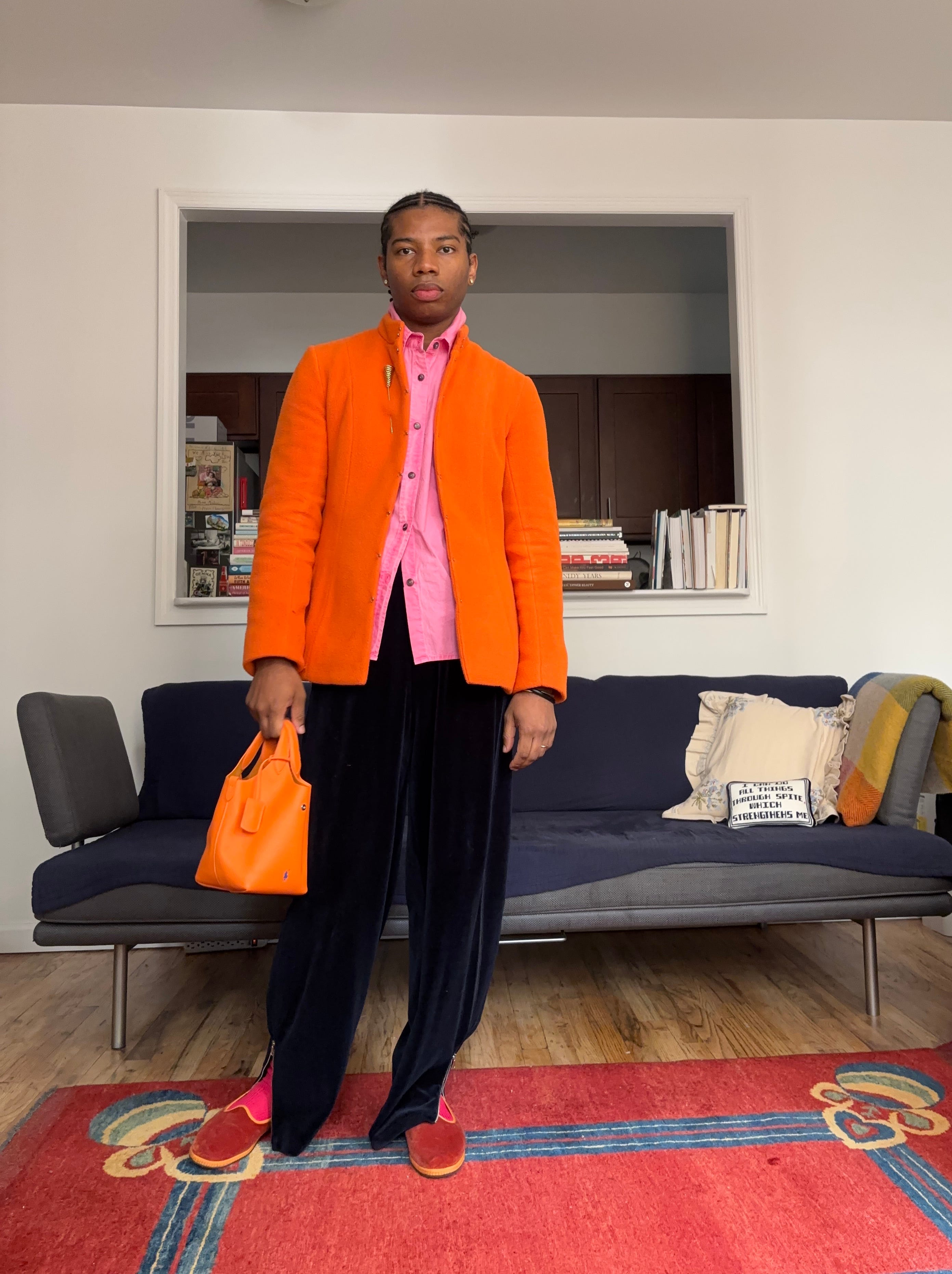
One color combination that feels unexpectedly right to me at the moment is pink, orange, and navy. Pink softens the otherwise formal nature of navy, orange adds a jolt of optimism, and navy grounds the whole thing so it never feels too precious. It’s refined but still playful. And during the holidays, when everything leans metallic or leans into the predictable red and green, this trio stands out beautifully, vibrant without being too on the nose.
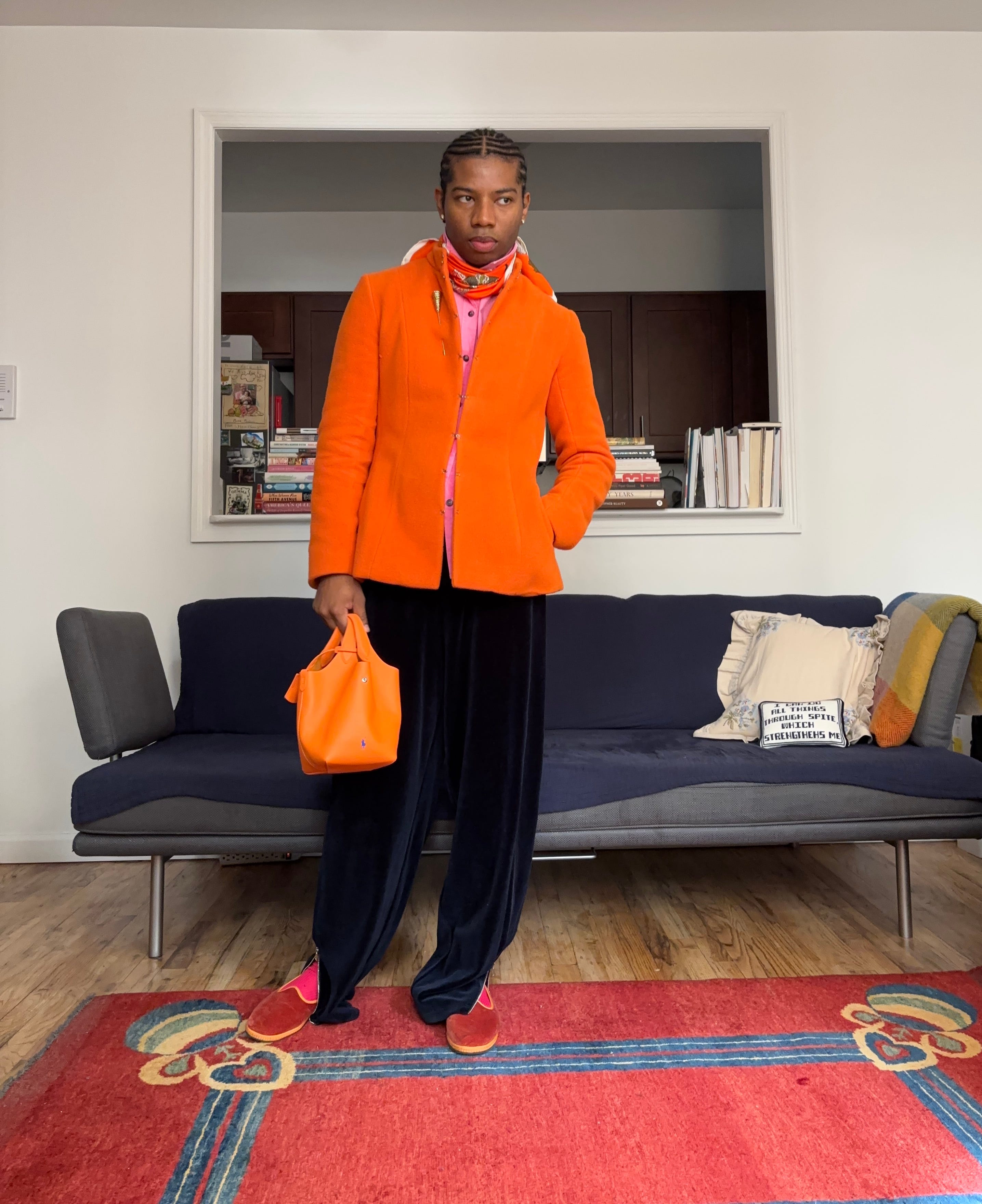
When mixing prints, I’ve always said that the key to making them work is having at least one color in common. That shared tone ties them together and keeps the look from feeling chaotic.
Of course, we all have our comfort zones when it comes to color and print. The fun part is figuring out which level of experimentation you’re ready for. And while we’re on the subject, I’ve rounded up a few pieces worth considering if you’re looking to bring more color and print into rotation.
That’s all from me today. Talk again mid-week.
XX
JJ
The grey sandwich w the pink & red filling!!!!
I’m on a plane wearing a grey sandwich w NO filling & can’t wait to add the pink & red when I get home.
Really masterful, Jalil
navy pink and orange!!!! ✍️